Logo Color Schemes
Logo Color Schemes
Analogous

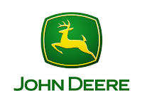
This logo uses the analogous colors of green, yellow-green, and yellow. I think the company probably chose these colors because they represent the grass, and sun, and an overall outdoor environment.

This logo uses the analogous colors of red, red-orange, orange, yellow-orange, and yellow. I think the company probably chose these colors because they are also warm colors, and they make you think you will have a good experience with their company.
Complementary

This logo uses the complementary colors of blue-violet, and yellow-orange. I think the company probably chose these colors because they wanted to show the contrast between Fed and Ex.
This logo uses the complementary colors of green, and red. I think the company probably chose these colors because it is a lemon-lime flavor, and the green represents that. I also think the red dot may represent fresh fruit, or that it's natural.
Cool

This logo uses the cool color of blue. I think this company probably chose this color because it represents the cold, minty taste that it has.

Monochromatic


This logo uses the monochromatic colors of blue, shaded blue, and tinted blue. I think the company probably chose these colors because they are a car company, and the blues represent how industrial and strong they are.
Triad Color

This logo uses the triad colors of red, yellow, and blue. I think the company probably chose these colors because it is the schools colors, which I think is because it is a jayhawk.
Warm


This logo uses the warm color of red. I think the company probably chose this color because it represents the warmth that their products have.


Comments
Post a Comment