Posts

Showing posts from January, 2018

Name Typeface Project

Image
Name Typeface Project Project Overview In this project, we used Adobe Illustrator to write our name, and identify parts of a typeface. We labeled the Caps Height, the x-height, and the Baseline. After that, we identified and labeled 10 more parts on the letters. It was a very quick and easy project. The final product is my first and last name, with labeled typeface parts. What Did I Learn About Typefaces? With this project, I learned a lot about different typefaces. I learned about Serif fonts, and that they have serifs, which stick out from the lettering. These tend to be more formal. There is also Sans Serif fonts, which don't have serifs. Sans is French for without. These fonts tend to be more informal. There is also more decorative fonts, which can be used for logos and signs, as long as they're used appropriately. I also learned that fonts can be used in the wrong situations. Be careful when choosing your fonts!
My Color Wheel

Image
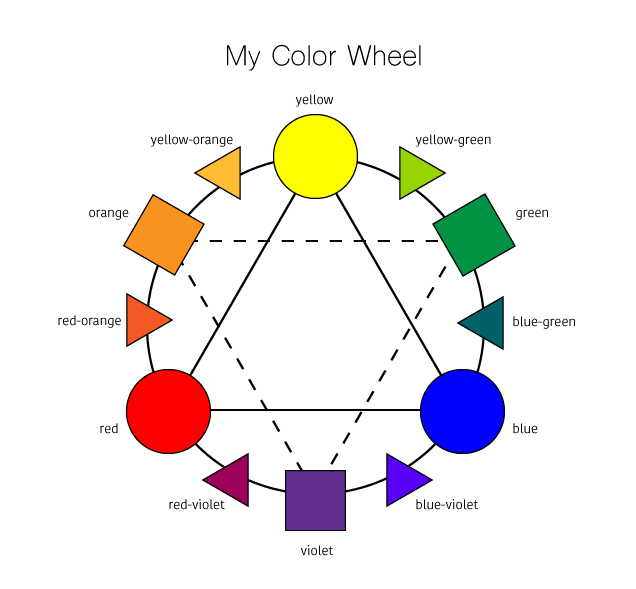
My Color Wheel Project Process This was our first project in the Graphic Design rotation of e-Comm. This project was to create our own color wheel. To do so, we used the computer software Adobe Illustrator. The process included creating shapes with the shape tool and lining them up correctly with the selector tool. Then fill them with the correct color, and labeling them with the text tool. It tool one day, and was not very challenging. What I Learned This project has helped me learn how to use Adobe Illustrator, and what all the tools are for. It also showed me that graphic design is a lot more complicated than I thought it was. I also learned about colors, and terminologies for everything on the color wheel. I learned about mixing colors, and that the primary color always comes first in the name of a tertiary color.  Conclusion Overall, I am very happy with how my color wheel turned out. It is very clean and organized. I think the colors I chose were very accurate. I

Logo Color Schemes

Image
Logo Color Schemes Analogous This logo uses the analogous colors of green, yellow-green, and yellow. I think the company probably chose these colors because they represent the grass, and sun, and an overall outdoor environment. This logo uses the analogous colors of red, red-orange, orange, yellow-orange, and yellow. I think the company probably chose these colors because they are also warm colors, and they make you think you will have a good experience with their company. Complementary This logo uses the complementary colors of blue-violet, and yellow-orange. I think the company probably chose these colors because they wanted to show the contrast between Fed and Ex. This logo uses the complementary colors of green, and red. I think the company probably chose these colors because it is a lemon-lime flavor, and the green represents that. I also think the red dot may represent fresh fruit, or that it's natural. Cool This