Posts

My Logo

Image
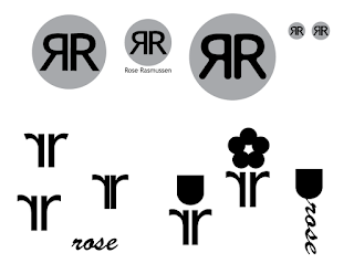
My Logo Process Attached are all the art boards from my logo design project. The process of creating my own logo was a long one. I started out by sketching my ideas. I tried many different shapes and styles. Once I decided on my top 3 to bring to life, I went to Adobe Illustrator. I started with black and white, just to see if the shapes would compliment each other, or be appealing. I tried my simplest circle idea, and it went well. When I tried to do the more advanced ones with odd shapes, I didn't have enough Ai experience or knowledge to make one well. I tried to do them implying the rose, and using circles, but I did not like how it looked. Then, when I decided to just stick with the simplest option, it was time to add color. I began with trying analogous colors for contrast between the circle and the letters. I decided I liked the tone and simplicity of the blues. While playing with color, I wondered what it would look like with a stroke. So, I tried the dif...
CSS and CARP Design

Image
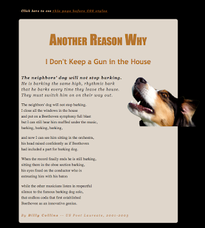
 Overview This was a web design project to change a poem layout, adding CSS styles and CARP. The only differences between the two files is that one has been changed to be easier to read, and more appealing to the eye. The link at the top will switch the file that's open. Changing the styles is done in the code. The code isn't seen in the final website. There are many ways to change the code. You can go into the code and change it manually, or you can go into design mode and edit the page, and the code will change for you.  Contrast My contrast improved a lot in the second file. There now is color contrast, typeface contrast, and font size contrast. The heading stands out much more. The poem isn't all exactly the same font or style. The first line is a key line, so it's bold. The headings are very important, and draw your eyes in, so it's very necessary that they are the biggest things on the page. Alignment  In the first file, everything is aligned t...

My Personality Type

Image
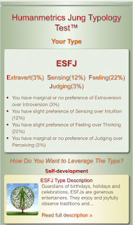
My Personality Type My Myers-Briggs personality type is ESFJ. This means that I am extravert, sensing, feeling, and judging. Overall, this means I like to work with others, follow through, notice, and provide. Sally Field, an actress, shares this personality type with me.  How Well Does This Describe Me? This is pretty accurate. But, although I tend to use feelings as factors of decision making, I also weigh thinking and thought process very much. I am enjoy being in the company of people I know. When it comes to people that I'm meeting for the first time, I am very introverted for a while. This also kind of explains why I prefer to work with others, and why I like to do what I can to meet deadlines. How Does This Clarify My Role? This clarifies how, and why I tend to take on a role where I help people, want everyone to get along, and work hard to get where I want to be.  When your personality matches with your type, that means that your type is probably very ...

Oz Poster

Image
Applying CARP to the Creation of a Poster Contrast I made the title the main focus point by making it the biggest thing I made the date and time large for readers to see I made the title a different for to fit the tone I used contrasting colors against the background for easy reading Alignment I aligned things to the left, with some pieces to the right for some contrast and balance I centered the silhouette of the characters to be a focal point over the background Repetition I repeatedly used Times New Roman as my font for the information I chucked together pieces and alternated their alignment in a pattern I bolded the date and the visit as headings to their section/group Proximity I grouped together key things that were related I allowed breathing space around the edges

Name Typeface Project

Image
Name Typeface Project Project Overview In this project, we used Adobe Illustrator to write our name, and identify parts of a typeface. We labeled the Caps Height, the x-height, and the Baseline. After that, we identified and labeled 10 more parts on the letters. It was a very quick and easy project. The final product is my first and last name, with labeled typeface parts. What Did I Learn About Typefaces? With this project, I learned a lot about different typefaces. I learned about Serif fonts, and that they have serifs, which stick out from the lettering. These tend to be more formal. There is also Sans Serif fonts, which don't have serifs. Sans is French for without. These fonts tend to be more informal. There is also more decorative fonts, which can be used for logos and signs, as long as they're used appropriately. I also learned that fonts can be used in the wrong situations. Be careful when choosing your fonts!

My Color Wheel

Image
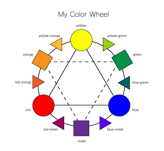
My Color Wheel Project Process This was our first project in the Graphic Design rotation of e-Comm. This project was to create our own color wheel. To do so, we used the computer software Adobe Illustrator. The process included creating shapes with the shape tool and lining them up correctly with the selector tool. Then fill them with the correct color, and labeling them with the text tool. It tool one day, and was not very challenging. What I Learned This project has helped me learn how to use Adobe Illustrator, and what all the tools are for. It also showed me that graphic design is a lot more complicated than I thought it was. I also learned about colors, and terminologies for everything on the color wheel. I learned about mixing colors, and that the primary color always comes first in the name of a tertiary color.  Conclusion Overall, I am very happy with how my color wheel turned out. It is very clean and organized. I think the colors I chose were very accurat...

Logo Color Schemes

Image
Logo Color Schemes Analogous This logo uses the analogous colors of green, yellow-green, and yellow. I think the company probably chose these colors because they represent the grass, and sun, and an overall outdoor environment. This logo uses the analogous colors of red, red-orange, orange, yellow-orange, and yellow. I think the company probably chose these colors because they are also warm colors, and they make you think you will have a good experience with their company. Complementary This logo uses the complementary colors of blue-violet, and yellow-orange. I think the company probably chose these colors because they wanted to show the contrast between Fed and Ex. This logo uses the complementary colors of green, and red. I think the company probably chose these colors because it is a lemon-lime flavor, and the green represents that. I also think the red dot may represent fresh fruit, or that it's natural. Cool This...