My Logo
Process

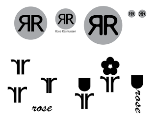
Attached are all the art boards from my logo design project. The process of creating my own logo was a long one. I started out by sketching my ideas. I tried many different shapes and styles. Once I decided on my top 3 to bring to life, I went to Adobe Illustrator. I started with black and white, just to see if the shapes would compliment each other, or be appealing. I tried my simplest circle idea, and it went well. When I tried to do the more advanced ones with odd shapes, I didn't have enough Ai experience or knowledge to make one well. I tried to do them implying the rose, and using circles, but I did not like how it looked.

Then, when I decided to just stick with the simplest option, it was time to add color. I began with trying analogous colors for contrast between the circle and the letters. I decided I liked the tone and simplicity of the blues. While playing with color, I wondered what it would look like with a stroke. So, I tried the different color options and decided on a light blue circle with dark blue letters and stroke. I finished it up with mockups. Putting my logo on mockup pictures really helped me imagine what my logo would look like on the items shown. I am really happy with the way my logo turned out.


 Attached are all the art boards from my logo design project. The process of creating my own logo was a long one. I started out by sketching my ideas. I tried many different shapes and styles. Once I decided on my top 3 to bring to life, I went to Adobe Illustrator. I started with black and white, just to see if the shapes would compliment each other, or be appealing. I tried my simplest circle idea, and it went well. When I tried to do the more advanced ones with odd shapes, I didn't have enough Ai experience or knowledge to make one well. I tried to do them implying the rose, and using circles, but I did not like how it looked.
 Then, when I decided to just stick with the simplest option, it was time to add color. I began with trying analogous colors for contrast between the circle and the letters. I decided I liked the tone and simplicity of the blues. While playing with color, I wondered what it would look like with a stroke. So, I tried the different color options and decided on a light blue circle with dark blue letters and stroke. I finished it up with mockups. Putting my logo on mockup pictures really helped me imagine what my logo would look like on the items shown. I am really happy with the way my logo turned out.


Comments
Post a Comment